David Hicks, the renowned interior designer, believed you shouldn’t mix patterns at all if you can’t do it right. This shows how significant pattern mixing is in design.
But mixing patterns doesn’t need to scare you. Simple stripes or intricate designs can work together with proven techniques. The ‘rule of 3’ lets you combine small, medium, and large scale patterns that create visual interest. Your design should maintain a balanced 70% full and 30% empty space ratio.
Want to make your space come alive with different patterns and textures? This article will guide you through colour combinations, scale and proportion. You’ll learn everything needed to create a beautifully layered design that flows seamlessly.
Understanding Pattern Types
Patterns are the life-blood of interior design that bring visual interest and personality to spaces. You can create harmonious and minimalist interiors that match your priorities by understanding three main pattern types.
Simple geometric patterns
Geometric patterns create predictable visual order through repeating elements. Points, surfaces, lines, angles, and shapes come together in both two and three-dimensional structures to create a calm feeling. Clean lines and symmetry can take centre stage in minimalist spaces, from parallel lines to complex hexagons.
Geometric patterns adapt well to design styles of all types. These patterns remain a signature element of Art Deco, Mid-Century and Contemporary aesthetics. You can use them in both modern and vintage looks. Designer Greg Natale shows how to make the most impact by using line-focused patterns in wallpaper, throws and pillows throughout a room.
Natural patterns
Nature’s inspiration shapes these patterns to help us connect with the outdoors. Curved edges and flowing designs offer a softer approach to interior decoration. Floral and botanical elements add elegance and gentleness to your surroundings, especially ferns and leaf motifs.
Scale plays a vital role with natural patterns. Larger spaces work better with bigger patterns. Smaller areas look best with delicate prints to keep proper symmetry. Its also known that these organic forms can reduce stress levels by up to 60%.
Abstract patterns
Non-representational shapes create unique artistic designs in abstract patterns. These patterns let you experiment with colour since they don’t follow the same rules as illustrative designs. Abstract patterns’ evocative and transformative qualities bring fresh energy to any room.
Abstract patterns create symmetry despite looking random. They shine in contemporary settings and let you make bold statements without overwhelming the space. Textured linens with handprinted abstract patterns add depth while keeping visual harmony in a room.
Each pattern type has its own purpose in interior design. Geometric patterns create structured elegance. Natural forms help connect with nature. The secret lies in knowing how to use their unique characteristics to achieve the look you want.
Choosing Your Colour Scheme
Your choice of colour scheme builds the foundation for mixing patterns successfully. Colours deeply change the mood and energy of your space, so you need to think about their psychological effect.
Cool colour patterns for calm spaces
Cool colours like blues and greens create serene spaces that promote relaxation. Blue stands out as the top colour choice for 57% of men and 35% of women, bringing security and wisdom to spaces. Light sage combined with sky blue tones creates a spa-like feel. These colours blend perfectly with ordered patterns such as geometrics and stripes to create smart, mature looks.
To keep things balanced, cool-toned patterns work best with warmer neutrals instead of stark whites. Portland Stone Light or natural travertine shades make great companions for green patterns without harsh contrasts. Using different shades of the same colour in various patterns and scales leads to sophisticated results.
Warm colour combinations
Warm colours – reds, oranges, and yellows – fill spaces with energy and cosiness. These hues feel like a warm hug and make rooms more intimate and lived-in. You can achieve balance by using warm neutrals as your base, then add layers of different patterns in complementary warm tones.
The right proportions make warm colour combinations work. Keep a consistent colour palette while varying pattern scales when mixing warm-toned patterns. You can also pick two or three main colours and try inverting them across different patterns.
Chocolate browns offer an excellent option for spaces needing warmth and sophistication. These rich tones look stunning with clay and natural hues, adding depth without overwhelming the space. Floral patterns in summer shades bring light and warmth, while darker florals create more dramatic, intimate atmospheres.
The temperature of colours changes how we see a room. Warm overtones naturally draw attention, making them perfect for focal points. Cool colours create depth by appearing to recede. By blending these principles thoughtfully, you can design spaces that balance visual interest and comfort perfectly.
Mixing Different Patterns
Becoming skilled at pattern mixing starts with understanding fundamental design principles that bring harmony to your space. You can create visually appealing combinations that improve your interior design by doing this.
Scale and proportion basics
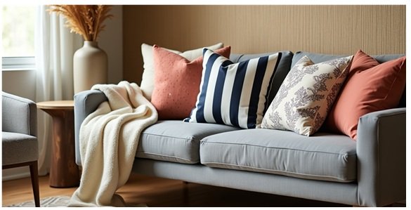
Scale plays a vital role in pattern mixing and serves as the foundation for creating visual interest. Large patterns dominate focus, medium ones bridge gaps, and small ones add subtle details to the design. Perfect balance emerges when you incorporate patterns of three different scales – a small, medium and large scale pattern.
Spatial dynamics matter when selecting patterns. Single motifs or standalone images count as large patterns in terms of visual weight. You should pair oversized decor motifs with tiny chequered curtains to establish balance without overwhelming the space.
Pattern spacing rules
Your space needs careful pattern distribution. Stripes act as chameleons in interior design, and their linear repetition creates a visual baseline that allows other prints to shine. Visual harmony works best when you limit yourself to three or four different patterns that share the same background colour.
Pattern spacing needs strategic planning. Pattern works effectively on one or two windows, yet covering three large windows with patterns might overpower one side of the room. A better approach would be to add patterns on furniture pieces like sofas, chairs, or beds to maintain balance.
Creating visual balance
Thoughtful pattern placement and colour coordination create visual balance. The best results come from picking one dominant pattern as your ‘hero’ – typically the most eye-catching design – and supporting it with quieter, complementary patterns. This approach prevents visual chaos while maintaining interest.
Perfect equilibrium comes from incorporating solid colours between patterns to provide visual breathing space. The patterns should flow throughout the entire room rather than concentrating in one area. Your space will feel both dynamic and cohesive through careful attention to scale, spacing, and balance.
Adding Texture Layers
Texture is a key design element that shapes how spaces feel and work. You can create rich, visually interesting interiors by carefully layering different textures that appeal to both sight and touch.
Smooth vs rough textures
Sleek, polished surfaces with smooth textures reflect light in unique ways as you move around a room. These textures bring a modern, sophisticated feel, but too much can make your space feel cold or uninviting. Rough textures, on the other hand, add warmth and substance that make rooms feel cosy and well-grounded.
The secret lies in mixing contrasting textures wisely. Try combining smooth materials like glass or metal with unpolished wood or stone. This blend creates eye-catching interest without overwhelming anyone’s senses. Rough or coarse textures naturally fit rustic and traditional interiors, while glossy surfaces work better with contemporary and trendy design styles in Australia.
Visual vs tactile textures
Visual texture is what your eyes see, while tactile texture is what your hands feel. Tactile textures have three-dimensional qualities that play with light and look different from various angles.
Here’s how to use both types well:
- Add interest with visual textures through paint effects or wallpaper without changing the surface feel
- Build layers with tactile elements in your upholstery, rugs, and decorative pieces
- Think about how light works with each texture – smooth surfaces bounce light evenly, while raised textures create shadows
Tactile textures shape comfort and function. Soft textures naturally make people feel welcome and relaxed. Visual textures keep spaces interesting by adding depth without actual dimension.
Note that texture affects both looks and sound – bumpy and porous surfaces soak up noise, while smooth ones magnify it. By smartly mixing visual and tactile elements, you’ll create spaces that please multiple senses and still work well for everyday use.
Conclusion
Pattern and texture combinations can convert ordinary spaces into visually captivating environments. The process of mixing different elements might seem daunting, yet understanding basic principles makes it achievable and enjoyable.
Successful pattern mixing begins with the right colour scheme for your space. Cool tones create tranquilly while warm hues bring energy. Your space’s unified look depends on consistent colour relationships. Scale and proportion will guide you – large, medium, and small patterns create harmony when balanced properly.
Texture brings a new dimension to your design narrative. The combination of smooth and rough surfaces, along with visual and tactile elements, creates depth that engages multiple senses. These guidelines will help, but your instincts matter most – your space should reflect your personal priorities.